In the previous post, we discussed an alternative to cross-validation to select the number of components to retain. The scree plot can be a good visual alternative if data exploration is more important than prediction. In this post, we will go through the interpretation of the scree plot and how we can derive the number of components to choose.
General characteristics of a scree plot
In short, cross-validation repeatedly evaluates the model performance in “independent” sets of samples that are left out when fitting the model. Usually, the prediction error ||y − ŷ||2 is taken as metric for how good a model is. For OmicsPLS, the numbers that minimize this prediction error is then taken as “the best”.
It’s this definition of “the best” where several approach differ. With the above steps, we select the model that can best predict y in samples that we haven’t observed yet. Sometimes, however, this is not what we want. For example, in a descriptive study, the prediction error is of secundary interest, especially when we miss out on information about the samples. Or, when interpretation of the model parameters is the main aim. A model that is based on the prediction error might be difficult to interpret (too few components retained for example). Therefore, we consider an elegant (at least, in my opinion) alternative to the cross-validation.
The scree plot
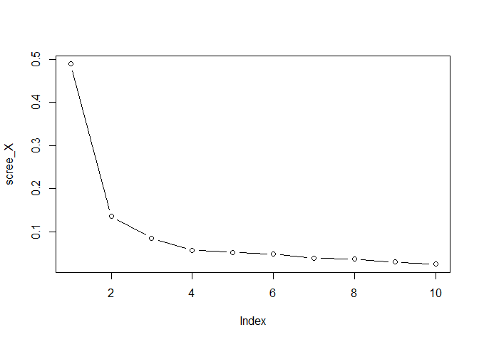
The scree plot is a visual way to select the number of components in PCA, PLS, Factor analysis, and also OmicsPLS. The basic idea is that we look at the amount of variance that is explained by each component. If the data are of “low rank type”, meaning that few components explain most of the variation, then this can be seen clearly in a scree plot. This is often the case with highly correlated variables. If the data are very noisy, or the variables are not correlated, then it’s difficult to derive conclusions from a scree plot.
If we take PCA as example, we know that it summarizes the data into principal components. Each of these components explain part of the total variation in the data. The first component will explain the most, then the second, etc. From a certain number of components on, we will have that these components explain very little variation of the data relative to the first few. Or relative to the total variation. In that case, it makes sense to only retain the first few components, since the rest doesn’t seem to explain a lot.
The same idea can be used in OmicsPLS, although it’s slightly more complicated. Remember that we have three numbers of components: the number of joint, the number of $x$-specific, and the number of $y$-specific. I developed a heuristic to get an estimate of numbers of components to retain, summarized in this workflow:
- Load your input data matrices
XandYin R. We take simulatedXandY:
set.seed(11102020)
# First simulate X from 3 components
# Note that these components are not orthogonal!
X <- tcrossprod(
  matrix(rnorm(100 * 3), nrow = 100),
  matrix(runif(10 * 3), nrow = 10)
)
# Now define Y as X plus noise
Y <- X + matrix(rnorm(100 * 10), nrow = 100)
# Finally, add noise to X
X <- X + matrix(rnorm(100 * 10), nrow = 100)
- Plot the eigenvalues of
X, by running
scree_X <- svd(X, nu=0, nv=0)$d^2
scree_X <- scree_X / sum(scree_X)
plot(scree_X, type = "b")

comp_X <- 3 #or 2, or 4, whatever you like
choose the total number of components for X 3. Plot the eigenvalues of
Y, by running
scree_Y <- svd(Y, nu=0, nv=0)$d^2
scree_Y <- scree_Y / sum(scree_Y)
plot(scree_Y, type = "b")

comp_Y <- 3
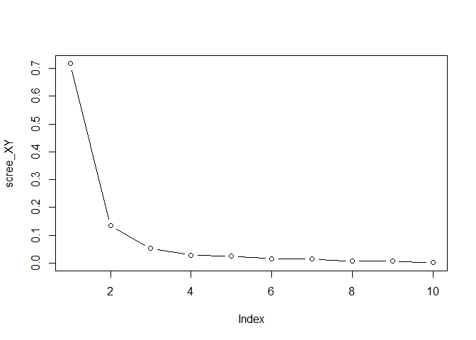
choose the total number of components for Y 4. Plot the singular
values of the covariance between X and Y (not squared)
scree_XY <- svd(crossprod(X,Y), nu=0, nv=0)$d
scree_XY <- scree_XY / sum(scree_XY)
plot(scree_XY, type = "b")

comp_XY <- 3
Choose the number of joint components based on the plot 5. The number of
joint components r is given by step 4, comp_XY. The number of
X-specific components is given by step 2 minus step 4,
comp_X - comp_XY The number of y-specific components is given by
step 3 minus step 4, comp_Y - comp_XY
The heuristic assumes that the number of eigenvalues in $x$ and $y$ are the sum of the number of joint eigenvalues, and the specific eigenvalues. Therefore, to get the number of specific components, you subtract the two as described. Since no repeated fitting is involved, it’s much faster than cross-validation.
A final word of caution: calculating crossprod(X,Y) when both X and Y are high dimensional is a bad idea. The output is a matrix of size ncol(X)*ncol(Y) Instead, calculate tcrossprod(X,X) %*% tcrossprod(Y,Y) as an approximation if the sample size is smaller than the number of variables. You then get
scree_XY <- sqrt(svd(tcrossprod(X,X) %*% tcrossprod(Y,Y), nu=0, nv=0)$d)
This matrix is of size nrow(X)*nrow(Y).
Summary
As an alternative to cross-validation, we went through the scree plot. From the scree plot, and after a subtraction step, the number of joint and specific components can be estimated. These numbers can then be used to fit OmicsPLS to the data.
Questions? Comments? Let me know!